This animation showcases my running statistics over eight weeks for a running app’s bimonthly report.
My intended audience is runners interested in their progress.
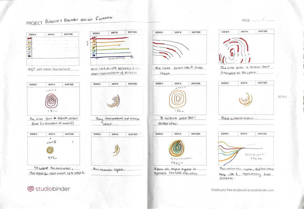
As an athlete, I use Strava and Garmin Connect apps to log my runs, meaning I have a distance and elevation database. After eight inconsistent weeks of training due to illness and racing, I thought would be interesting to depict the distance and elevation I ran as a data visualisation animation (each week differed dramatically).
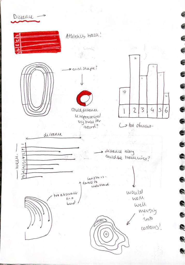
I wanted to convey my elevation data less conventionally to contrast from the typical bar/line graph formats.
I wanted to convey my elevation data less conventionally to contrast from the typical bar/line graph formats.
Both apps use maps, so I thought it would be apt to visualise my elevation data with typical map conventions: contour lines (lines are closer together the steeper the elevation).
An eight-lane athletics track is another key running motif, so I included a track-inspired bar chart representing the distance run in my animation.
An eight-lane athletics track is another key running motif, so I included a track-inspired bar chart representing the distance run in my animation.
My animation constantly evolves through wipe and line sweep transitions, representing the constant motion of running.
Audio of my footfall accompanies the animation and changes in volume depending on elevation amount.