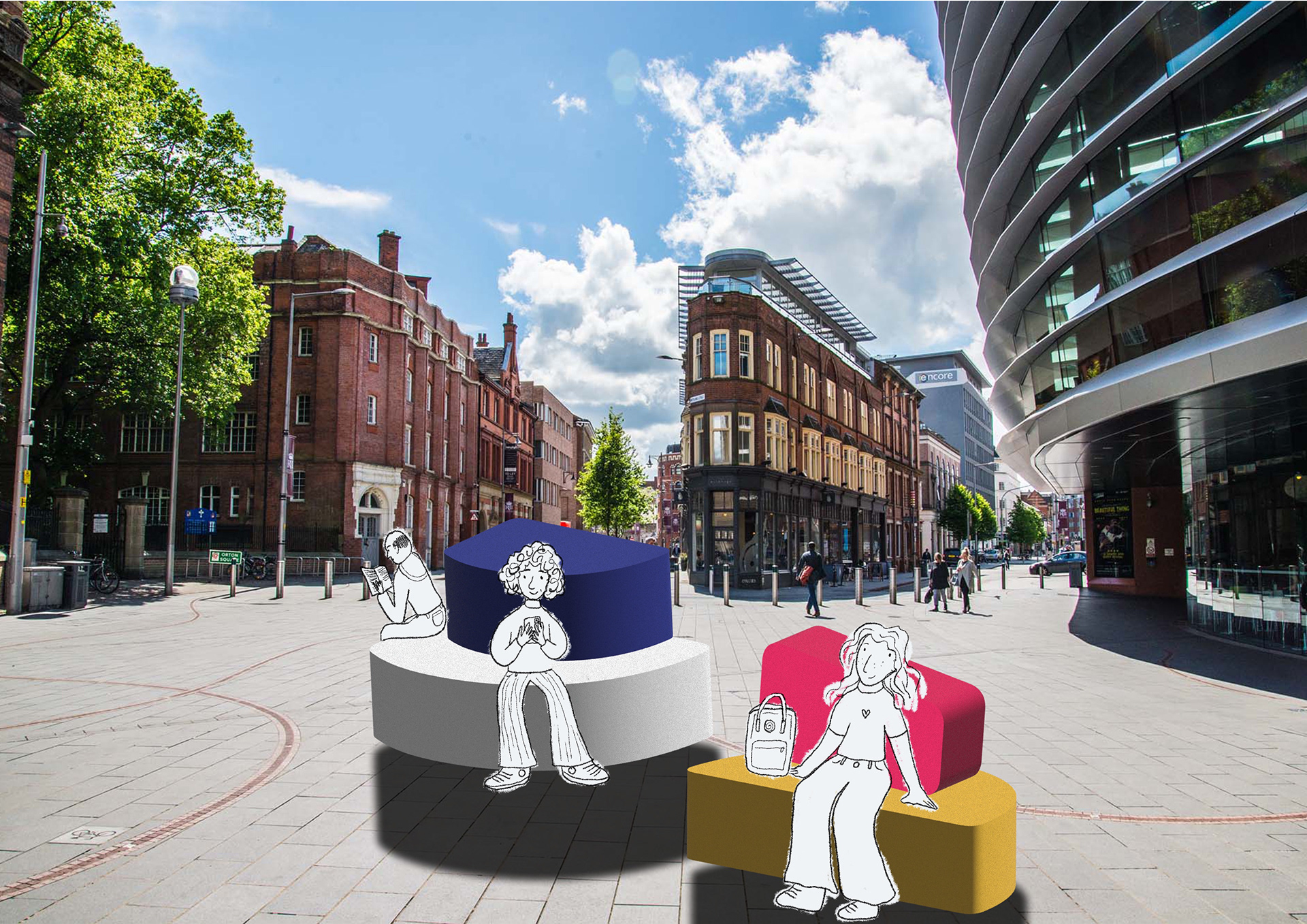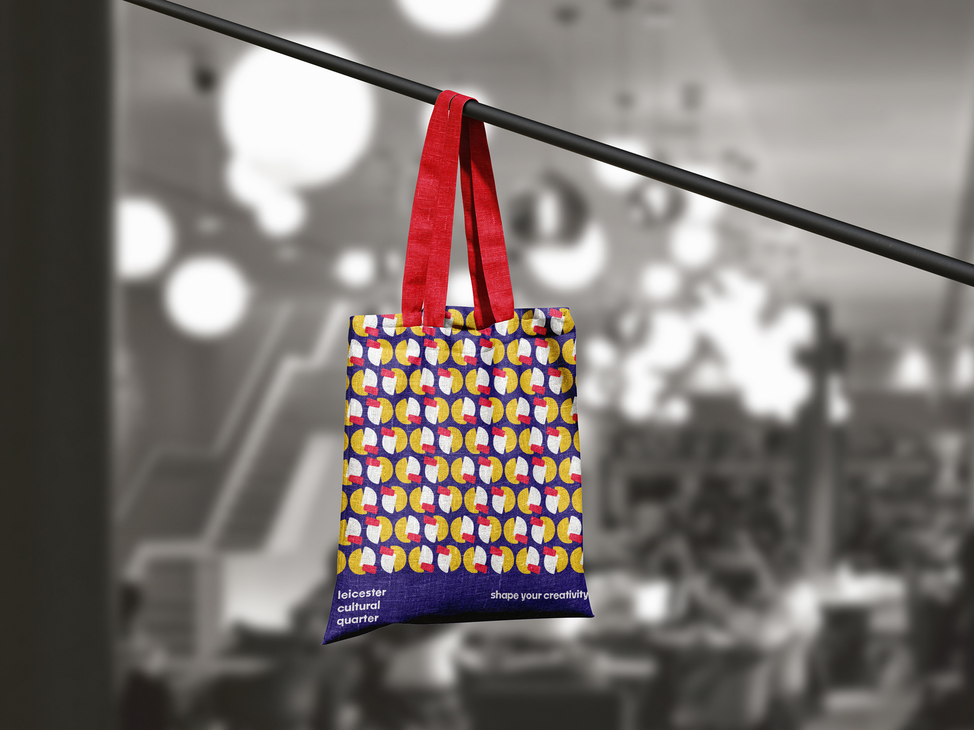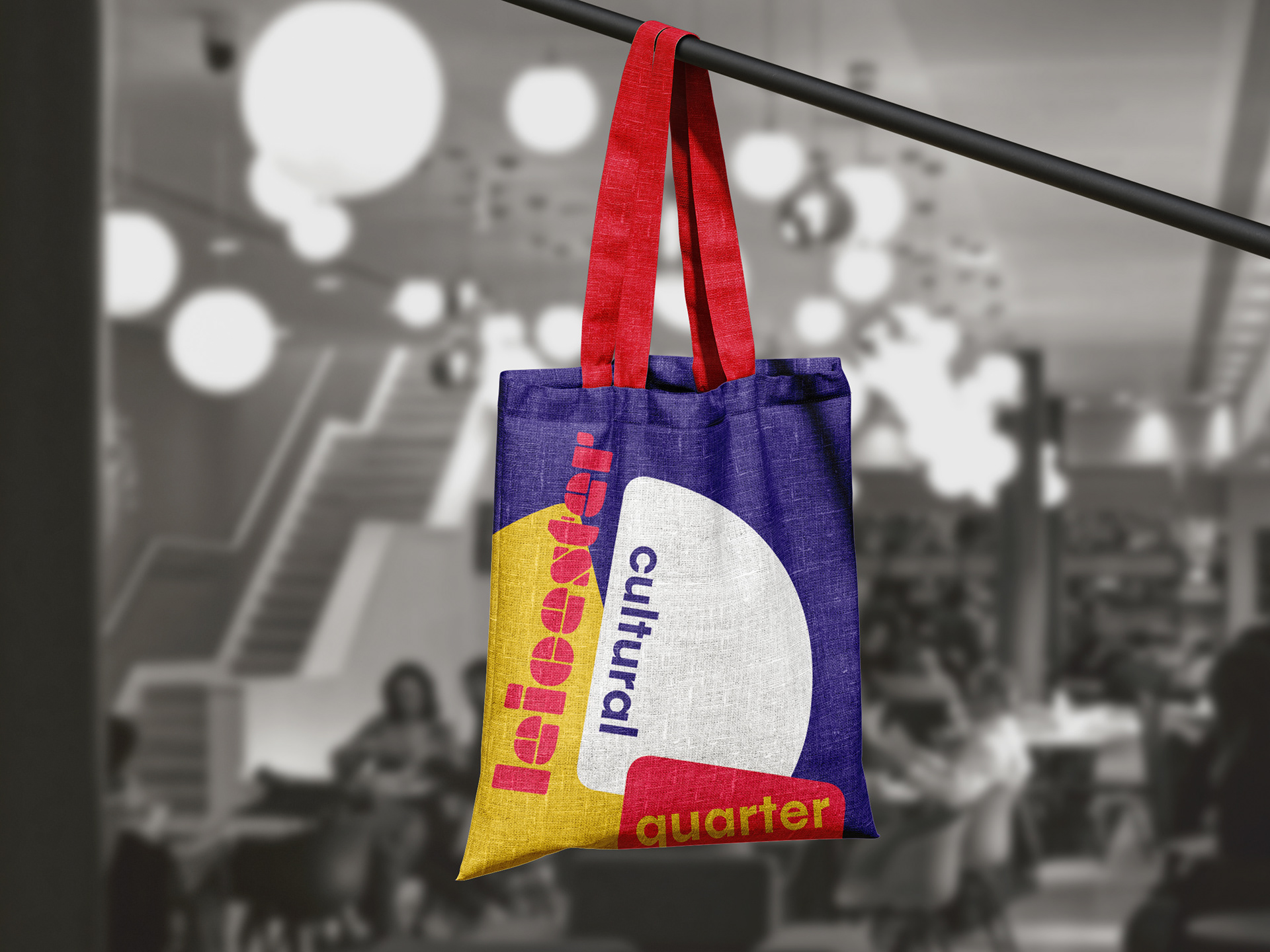


This project focussed on the rebranding of Leicester Cultural Quarter - a vibrant hotspot for creatives, boasting theatres, cinemas, workshops, restaurants and bars. I created a brand focused around three interchangeable modules that could represent the area's key attractions. When formed together, the modules can make an L, C, or Q (as seen in the main logo). The use of near-primary colours and shapes suggests how the area is founded on creativity, but does things a bit differently. This work was picked to be exhibited at the LCB 20 Design Festival.
